Branding and Design Systems
More than 150 brands creation and rebranding experience
Brand - COMPANY IDENTITY
The biggest intangible asset of any company is trust and a brand is what creates and enhances that first impression of a company. A brand is the image a company creates of itself. It defines the role of the brand in creating the image of the company - its goal is to distinguish it among competitors.
Rules of the brand includes a series of both technical requirements and compliance with philosophical and psychological factors in its creation. The digital revolution has significantly changed the form and content of the brand, but has not changed the essential - its function.
CONTENT
Design is both a noun and a verb. It is the beginning and the end, it is the creative process and the final product itself. Content is design raw material.
FORM
Form is the reorganization and manipulation of content. Forms of design expression include texture, space, contrasts, balance, proportion, ornament, repetition, scale, size, shape, color, value, material, and weight. When these raw materials are combined, the desired result is confidence, unity, harmony and grace. The perfection of the design depends on the integration of all the ingredients, which is practically impossible sometimes. In addition to everything comes the creative moment, intuition and experience. There is no formula for good design, every problem is unique, as is every solution
FUNCTION
Form and content are interactive and interdependent and create function. To the extent that form manipulates content, content determines the nature of that manipulation. Form intensifies, highlights, obscures or even changes the meaning of function. In the digital world, this interplay of content and form is critical to business development - function is made or lost.
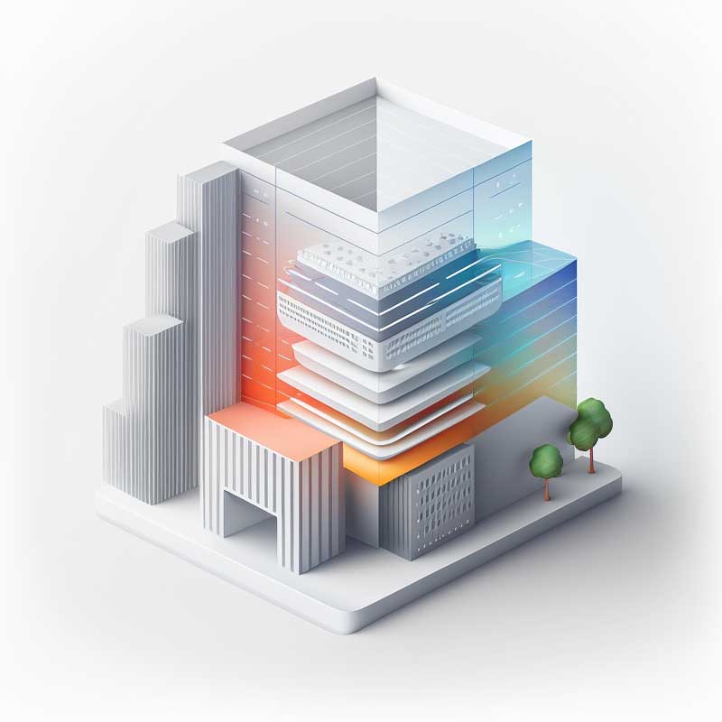
DESIGN SYSTEM IN THE BRANDING
DESIGN SYSTEMS - UX and UI
Design systems streamline work processes, promote communication and consistency, increasing the company's competitiveness in digital environments. A design framework is a set of UX and UI design guidelines, including core elements and standards, that are clearly documented for future reference. The best design systems combine UX (applies to both physical and digital products) and UI (focuses on the aesthetics of digital products) design to deliver a satisfying user experience.
Design systems turn chaos into order by creating a common visual language for designers and developers, allowing them to constantly improve and innovate. Even as personnel changes and technology evolves, a good design framework ensures credibility for a brand, its online site, and a consistent user experience, building a strong relationship between products and their users.
Principles of identity DESIGN
In the digital environment

Design systems and branding
A brand system is a set of rules for your brand, while a design system is a set of tools used to create a cohesive and strong brand.
A design framework is a collection of design elements and guidelines that help organizations create consistent and unified digital products. These design elements include visual elements such as typefaces, colors and icons, as well as guidelines for creating an intuitive and accessible user experience. A design framework provides a framework for creating digital products that are aligned with an organization's goals and objectives, and helps ensure that design and development teams work together to create high-quality products that meet user needs.
Principles of identity formation
- Simple: It should be easy to understand and recognize, as well as easy to reproduce in different environments.
- Meaningful: It creates an important intangible link with the target audience.
- Long-lasting: it can withstand the test of time and does not depend on the latest fashion trends.
- Consistent: A strong brand identity is consistent across all elements of a company's visual communication.
- Unforgettable: It must be memorable and able to stay in people's memory.
EXAMPLES of perfect form, functionality and content design
MEDURGA
Medurga is a company that creates, designs and manufactures unique concepts of metal works, so the logo was created as an author's signature, symbolizing the uniqueness of the works and their value. The basis of every brand is the successful visual integration of an idea and a concept.
SHOES BOX
The name SHOES BOX in front of the store, what should be the logo and the footprint of the shoe instead of the letter O was designed as a mnemonic visual hook to appeal to potential buyers.
Thoughtful visual compositions for advertising materials in the urban environment were recognized as the best in the Riga Outdoor media competition.
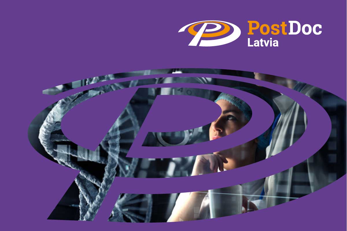
Post Doc
The graphic identity of Post Doc was created for the implementation of various post-doctoral study projects both in Latvia and abroad. An important factor in the development of the identity was its integration into the visual identities of already existing educational development projects.
ASI Sporta klubs
When creating the ASI sports club brand, the specifics of dynamic sports clothing were taken into account, where the sports clothing itself is the primary source of communication. The dynamic, original design logo is created with the maximum applicability function for its transfer to clothing and competition place banners, flags.
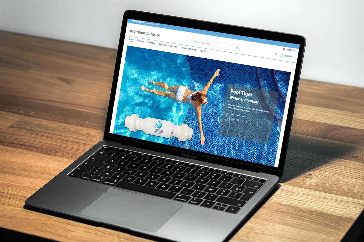
PREMOUT.COM
We have experience in creating effective brand names. Premout.com is built from the Premium Outdoor brand name making it more understandable and functional in the digital environment. The digital environment determines the shape and function of the logo - how it will look on different types of screens, icons, social networks. Thoughtful design systems help to successfully implement e-commerce projects.
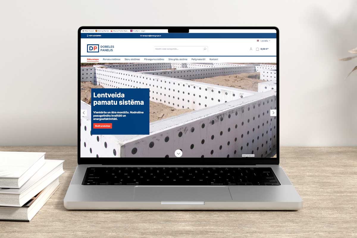
Dobeles panelis
In the digital agency SIA DEXT - Design for Next, a large part consists of rebranding projects, where previously developed visual identities need to be improved and restored. The digital environment dictates more concise, direct and rational branding principles.
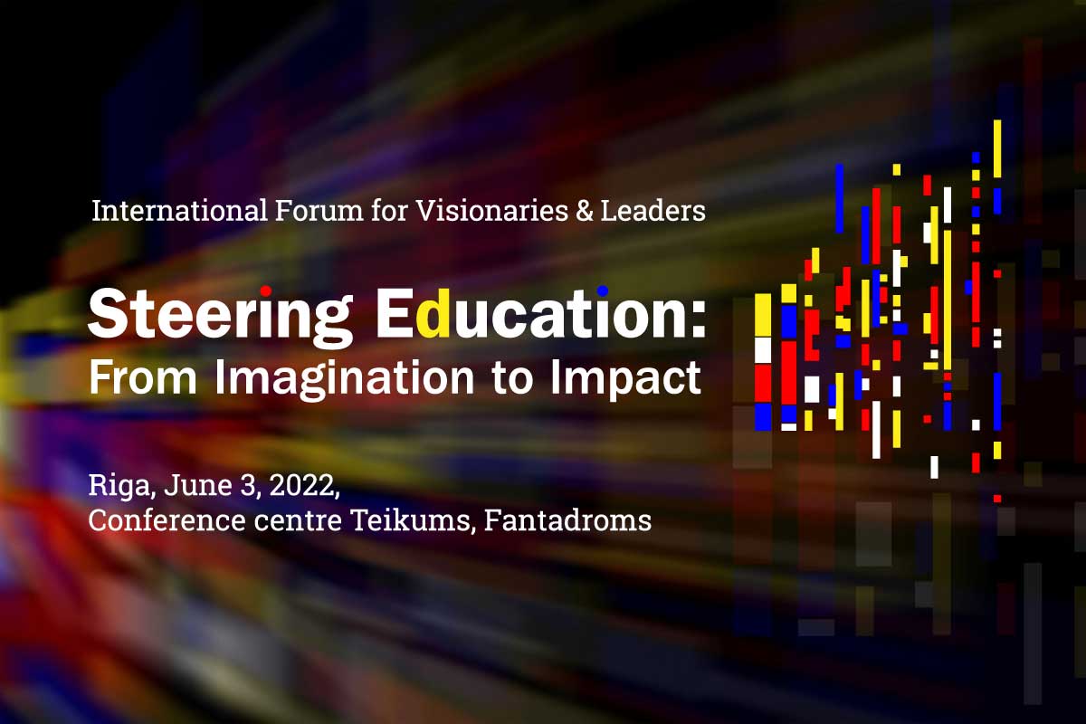
FUTURES 2050
Steering Education - from closed, close-knit structures to open, multi-layered and dynamically progressive structures. letter d (dimension, dynamic) - as the focal point of the sign, which marks the dynamics of change from a red dot - a prohibitive symbol to a blue dot - a point of openness and future perspective. A pixel as a symbol of the smallest unit of knowledge, from which different, free-standing or connecting structures are formed.
Pergolas.lv
Pergolas.lv is an e-commerce solution created by the Premium Outdoor segment for a specific product group - pergolas, gazebos and canopies. The UX and UI experience of e-commerce solutions was taken into account in the creation of the brand, successfully balancing the visual image with functionality, perception and the logic of the homepage.